Tuesday, May 26, 2015

Field Note 7

Herbert Bayer

Herbert Bayer was a painter, architect, graphic designer, sculptor, photographer,industrial designer, and considered one of the last master's of the Bauhaus Design School, founded in 1919 in Weimar Germany.


                                                Umeskinder, 1933, Herbert Bayer, private collection                                                                                                             


Bayer was a pioneer in experimental typography design, using the photomontage technique creating advertisements based in the avant guard arts as an art director for clients such as the Container Corporation of America, working under Walter Paepcke, the CEO. Also work with Paepcke included design consultation on the unique and enduring architecture of the Aspen Institute, in Aspen Co.


                                                          Aspen Institute, Herbert Bayer, Architect, Aspen CO


At one point  Bayer also served as the art director for Vogue Magazine's Berlin offices, before having to flee with his family from the Nazi propaganda officials, in 1938, to America, with only $25 to his name, as he was considered on of Hitler's Degenerate artists and was married to a jewish woman. In his later years he worked for the Atlantic Richfield Company as an art director, while also continuing to create fine art works and architecture for his own expression for museums, galleries, public institutions, as well as corporate and private collectors.


Bayer also studied under Vasily Kandinsky, when he was first enrolled in 1921 as a student at the Bauhaus, where he specialized in mural painting. I think his later works still retain elements of those early Bauhaus influences.


Herbert Bayer was born in Haag Austria, in 1900, and died at his home in Montecito CA, in 1985, at the age of 85.

 
                                                 Chromatic Gate, 1991,Herbert Bayer, Santa Barbara CA

Wednesday, May 20, 2015

Field Note 6


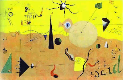
Paysage Catalan, Joan Miro

The word ‘Surrealism’ was coined by writer Guillaume Apollinaire in 1917. Surrealism, according to Apollinaire, is ‘truth beyond realism’. 
After the World War I, artists and intellectuals were looking for an escape against the harshness of reality. They wanted to reform the world their own way, greatly influenced by Freud and Jung for instance, they sought to investigate through their mediums into the unconscious aspect of the mind. In 1924, the Surrealist group was formed; its principal members being Max Ernst, Joan Miro and Andre Breton.
Artists were very interested in portraying artistic expressions of the subconscious, dreams, hallucinations and all manner of the worlds of the inner psyche. The surrealists created artwork and, poetry at times under hypnosis and utilized the process of automatic, stream of consciousness writing. These processes often manifested surreal, dream-like and unconscious works. 
Gala Of Spheres, Salvador Dali

To quote, Salvador Dali, "Surrealism is the symbolic language of the subconscious, truly a universal language, it doesn’t depend on education, culture or intelligence."
                                                               Deliberation, Mario Sanchez Nevado
Surrealism as an artistic movement of the past, has a profound and strong influence in the contemporary world of graphic design. The tools and ability to render the elements of the unconscious mind, from the world of dreams and the astral, to the well of unlimited imaginary worlds, can be more readily fabricated with the tools of our technological age, in ways the surrealist founders could only themselves dream. 
The digital mediums, in combination with photographic technologies, with their advances, are the vehicle for elaboration of the subconscious with such profound realism and ability to alter as such, that the line between real and imagined is indistinguishable. 
                                                          Temptation    Mario Sanchez Nevado

Wednesday, May 13, 2015

Field Note 5

I was so moved by the myriad imagery of our chapter studies this week, and many of the artists and designers I had familiarity with, but the one which stood out to me most was the small seeming vignette of the Three Brides by Jan Toorop, a dutch artist involved with the Art Nouveau. I was unaware of his work or history , so I sought more information, I found little yet quite a few more of his enchanting indescribable works of which I share here. These periods of graphic history and the requisite arts which accompanied the periods are the springboard dreams in my estimation and a well of beauty and ideas to farm from for future work.

FATALISME 1893 / Jan Toorop

Jan Toorop was born in Java in 1858. In 1872 he moved with his family to the Netherlands, and began his studies in Delft as well as Amsterdam. In 1880 he became a student at the prestigious Rijksacademie in Amsterdam.

After his studies he lived in Brussels Belgium where he became a member of the Les XXX, a group of artists. who were inspired by James Ensor. He at the time was primarily an expressionist painter , yet investigated impressionism as well as realism in his many works.

ANARCHIE 1894 / Jan Toorop

He married in 1886, and english woman Annie Hall, and moved between England,  Belgium and the Netherland where he developed his personal style for which he became recognized, Symbolist in nature it had dynamic , unpredictable lines based in javanese motifs, with willowy figures and curvilinear designs.

He became part of the Art Nouveau movement in his stylistic leanings there after, creating religious works, book illustrations, grapic designs and stained glass windows.
VROUW ANN DE RAND VAN EEN  MEER / Jan Toorop

Wednesday, May 6, 2015

Field Note 4

The Art Nouveau French Poster

Art Nouveau was an artistic movement which was popular around the turn of the century, form 1890 to 1905, short lived but made a significant mark in the design world. It infiltrated it's stylistic leanings in the field of not only art, but architecture, garment design, typography, furniture, and all manner of aesthetic artisan practice. Nouveau, the french term for " new art", is based upon organic curving lines found in nature and highly stylized expressions of this motif. The term whiplash, was often employed to describe the extravagant curves and lines of the forms. It was most often utilized in the print world in book production as well as that of poster art and advertising. The typography was often ornate and unique to any previous styles.


Alphonse Mucha,(July 1860- July 1939), was a Czech artist known for his elaborate and beautiful posters primarily designed for French advertisements, as he spent his latter life living in Paris. 
Mucha's work was exhibited at the 1900 Universal Exhibition in Paris which allowed him an international exposure and frequent imitation. He felt his works were created to communicate a spiritual message of beauty and nothing more. I have been fortunate to have had the original prints I feature on this blog, they have long since been sold, but I never fail to be nostalgic about their beauty which once hung upon my living room walls.


The Gyptis Protis

Poster created for the commemoration of the foundation of Marseilles, by Dellepiane, David ,(1886-1932), is a poster still in my possession. It is a work based upon the Greek Myth of 600BC of the Gyptis Protis, a love story about a king Nanus's daughter Gyptis and her choice of husband determined by whom she offers water in a beautiful vessel, for whom she chooses Protis a young Phocaean sailor. The typography is very bold and highly indicative of the period, with elaborations and designs true to the curving forms of the Nouveau era. I treasure this work above all.